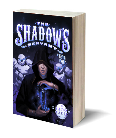
It’s with great pleasure that I’d like to present to you the cover for book two in the Shadow Magic Series, The Shadow’s Servant.
(Note: My newsletter subscribers got to see the cover early, and to get an in-depth view at the creative process. If that type of occasional news interests you, you can sign up here.)

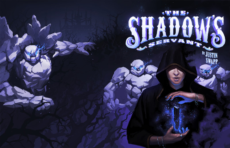
The front cover of The Shadow’s Servant
Like The Magic Shop‘s cover, I commissioned the great Arthur Wang to create book two’s cover. As an author, its great fun to choose your artist, and to engage in a different kind of creative work – the art side of things.
Arthur and my brainstorming went faster this time than it did with The Magic Shop. I’m sure that partly because it was our first time working together, but I think it was also because there was more unknown about the book at the time.
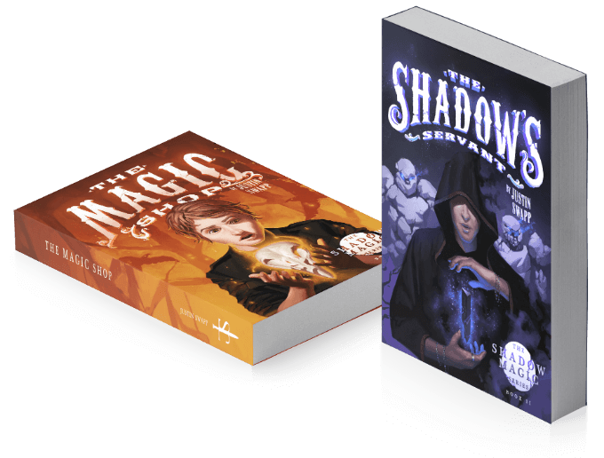
This time, however, we know where things are going, and, because this is a book in a series, we both thought it would be a good idea to try to keep elements from the first book present in the second cover. This would give the reader a feeling of continuity, and the sense that this cover belonged in the series.
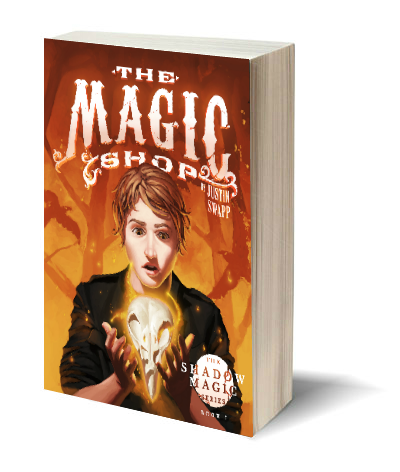
The way we kept a “series feel” was to go back and add a series badge to the first book, and then add it to the second as well. (The circle in the lower right hand corner that reads: The Shadow Magic Series Book II) The cover also uses the same hand-made typography that Arthur created for The Magic Shop.
Perhaps, most obviously, the cover has one principal character, centered on the book cover. Like the first cover, this shadowy, cloaked figure is suspending something in his hands – an obelisk. If you recall from the first book, Marcus, the main character, was magically floating a bird skull between his hands. There’s little question that this obelisk will be an important element to this book.
(continued below)
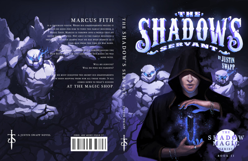
The full cover art work (for print) of The Shadow’s Servant. This is before we apply text, spine, and badge treatment to the cover.
Here is a full view of the cover’s front and back art without the obstruction of the text and other treatments. This cover was fun because my children actually helped give me some ideas to share with Arthur. My youngest son, Alexander, actually came up with the idea for a stone army that will appear in the book. These are the creatures that you see in various forms (or personalities, as the artist said) behind the cloaked figure on the front cover, and on the back cover. You’ll notice the shadows of dead trees creeping up from the bottom of the cover as well. This is because we’ll be visiting the shadow lands in this book, and a key location there, the Shadow Master’s palace, which can be seen in the far distance toward the top of the back page, above the stone giant’s outstretched arm.
And below this text you can see what the cover will look like with full text treatment, logos, badges, and bar codes. The shrewd eye might pick up that the text on the back of the cover is actually the back of the book blurb from The Magic Shop. Why? Because I haven’t written the blurb for The Shadow’s Servant yet. 🙂
I’m targeting the launch of The Shadow’s Servant for this summer.
Let me know what you think of the cover in the comments!
